For a list of articles in this series, go here: How To Set Up A Blog and Forum Article Index
Welcome to part nine of How To Set Up A Blog And Forum
Today we will set up widgets for WordPress. Widgets are customized spots on your blog which are mostly things that the visitor will see.
But first, I want to say three things:
1) I changed the theme at http://saltwaterfishkeeping.com/ to one called “Elegant Grunge”
I used it on another blog and I’m rather partial to it and so it’s there basically to show it to you.
2) If I can, I’m going to make the next post the last in this series as far as setting up the blog part. Though it’s been a lot of fun, and headaches, to walk you through step by step learning how to create a blog, we do need to move on.
So I’ll walk through setting up a page (again) and a post and really, I think that’s about all there is as far as major things. If you’d like me to cover something in setting up blogs that I’ve either forgotten about or that you want more details on, then leave me a comment or go to http://jeffwoodconsulting.com and fill out a ticket.
3) Widgets are a fairly personal thing. There’s not really a right way or a wrong way to do it. There’s things you probably should do if you’re doing a blog for a business that won’t matter so much if you’re doing a personal blog, but too much depends on what you personally want.
Also the theme you pick will affect your widgets. There’s some themes that have no widgets, some that have widgets on both sides, on one side and Elegant Grunge, the one that’s there for the moment, allows them both on the side and in the footer.
So I’ll set up some widgets for this tutorial, there may be more or less or different ones by the time you read this. I do like to experiment and change things so I make no promises that what you read here is what you’ll see there if you check back in a month or so.
So let’s get started. The first thing you want to do is bring up another browser window. You’ll have one window viewing your dashboard and the other window viewing your blog. So if your blog was at http://www.myblog.com you would have one window on http://www.myblog.com and the other at
Whenever you make a change on the ‘admin’ screen then go to the other window and press ‘F5′ or click on refresh to see what your visitors will see. If you don’t like the way the change looks, change it back.
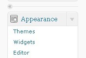
Now on with the show, under your dashboard you’ll look for the following on the left hand side of the screen:
widgets 11
Everything we are about to do is under the ‘Appearance’ heading under ‘Widgets’
widgets 2
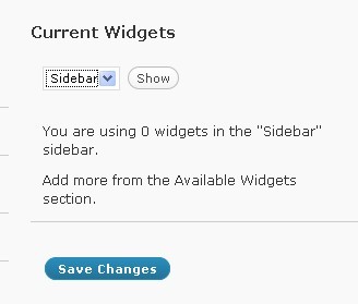
After you click on ‘Widgets’ you see the above screen on the upper left of your screen. Here it is telling you that you are using no widgets on the sidebar menu.
Again, this is theme specific so you won’t see the exact same thing unless you are using the same theme I am.
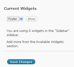
Use the drop down menu to go to the footer and click on show:
widgets 3
As you can see, I did not click on ’show’ before I snapped the picture (in case you missed it, it tells you where it’s currently viewing your widgets, just look at the picture again and you’ll find it). It would say the same if I had clicked on ’show’ that there’s no widgets in the footer. So I could have 3 widgets in the footer and 7 widgets in the sidebar, or whatever combination I realistically wanted.
The good and at the same time, annoying, part of this is that you are looking at either the sidebar or the footer, NOT at both. So it’s easy to get confused and think you are looking at one while viewing the other when you actually forgot to click on ’show’.
You have some widget viewing options by the drop down menu on the upper left side of the screen (don’t forget to click on ’show’):

widgets 4
Shows you all widgets that are available (activated).

widgets 5
Shows you all widgets you aren’t using.

widgets 6
Shows all the widgets you are using.
![]()
dualfeeds 1
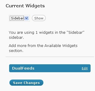
Let’s start with the DualFeeds widgets as it’s the top one. Click on ‘Add’ next to it’s name and on the right hand side of the screen you will see the following:
dualfeeds 2
So, click on ‘edit’ behind the name and you get:
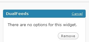
dualfeeds 3
Anytime you click on ‘edit’ you will be given the option to remove that widget, whether the widget itself can be customized or not.
The important thing is that if you want to keep your changes then you must click on ’save’ at the bottom of the list, not just on the ‘done’ on the individual widget (if it can be customized).
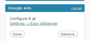
Now a brief look at the Google Adsense:

google 1
As you can see, you have three options. ‘Google ads’ puts an ad in your sidebar. ‘Google search’ puts a search box for Google in your sidebar and ‘Google Link Units’ Shows the links instead of the ads.
Where the ‘Google ads’ or ‘Google links’ appear in your posts and pages was decided under the Easy Adsenser configuration menu which was on your dashboard under ‘Settings’.
If you don’t like where they appear, change them.
google 2
Now we will look at Simple TwitterBox. Now you already entered your username and password, but that’s not all you need to do:
![]()
simpletwitter 1
Click on ‘Add’ and click on ‘edit’ when it appears on the right and you see the following:
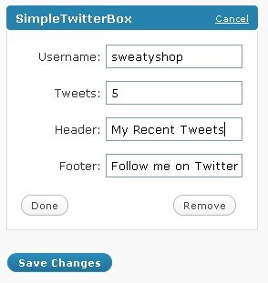
simpletwitter 2
As you can see, I already filled in the spots that were blank. Your username, how many of your last tweets, what the box says before (header) and after (footer) the tweets.
Now Yarpp:
![]()
yarpp 11
Yarpp doesn’t have options here, you either show them or you don’t. You customized it last time under ‘Settings’.
Now the next few are kind of an “if you want to”
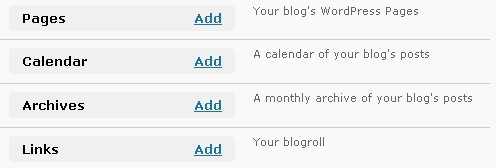
options 1
Pretty self-explanatory.
The next one you can add as many times as you want:
![]()
text 1
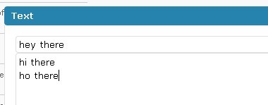
Puts a spot on your sidebar that displays whatever you put in the box, so Add it then click on ‘edit’:
text 2
Where I put ‘hey there’ is the title, the rest is the text box. Here’s what that looks like to the visitor:
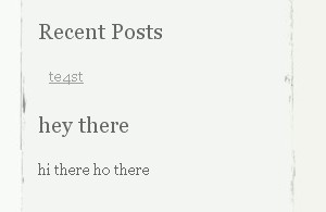
text 3
Yes, I know I misspelled ‘test’. It was just that, a test post so I could check something else. Sheesh, what a bunch of complainers…. ![]()
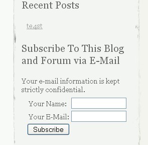
Here’s a more practical use for the ‘Text’ box, a subscription for the blog:
text 4
The ‘Subscribe to this blog and forum via e-mail’ is all in the title, the rest of it was simply copied from my autoresponder into the text box. I clicked on ’save’ and there you go.
On to RSS:
![]()
rss 1
Don’t be confused, this doesn’t add your RSS feed to your blog, this allows you to display the RSS feed of someone else’s blog or newspost.
misc 11
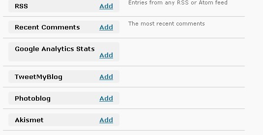
Ok, “recent comments” does just that, displays the most recent comments on your sidebar. “Google Analytics and Akismet” are running whether you add them or not. The difference is that if you add them then your stats are available for anyone to see.
“Tweetmyblog” is a dual plugin. Remember this is the one that will send a Tweet to Twitter whenever you update your blog. Well, it will also display your most recent Tweets if you add it as a widget.
Why use ‘Simple Tweetbox’ if ‘Tweetmyblog’ does both? Personal preference. I like the way ‘Simple Tweetbox’ looks more than I like the way ‘Tweetmyblog’ looks. That’s all.
You may have noticed that the order you are adding the widgets in is the order they are appearing on your blog. So currently, my blog’s widgets are in the following order:
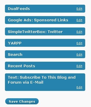
switched 1
I don’t like that order. The tweets change frequently, I want people to see the subscribe option nearer the top of the page and a few other things. So you can do one of two things.
You can very carefully plan it out and add the widgets you want in the order you want. Of course, if you change your mind or don’t like how it looks you can end up wasting a lot of time doing it that way.
So for the other way, just drag and drop and click on ’save’ and we now have:
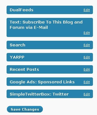
switched 2
I like this better, but I don’t know if it’ll stay that way. If I waited on getting it just right before I wrote this tutorial, then the tutorial would never get written.
SO let’s see how it looks to those visitors (if you’ve set up your screens like I told you to, then you already know how your blog looks):
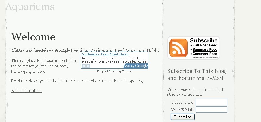
final 1
It’s a bit difficult to read, but part of my title is on top of (or under as the case may be) the top line on my welcome page.
Sigh, there’s always something.
Until next time
– Jeffery
